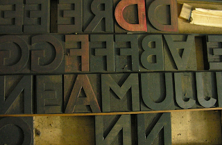
The London Underground typeface was designed by Edward Johnston in 1916. Johnston sans has a few distinct characteristics:
- Perfect circle within the O
- Diagonal square used as the dot above the i and j (also used for punctuation)
A brief history:
- First commissioned in 1913 and was completed in 1916 by Edward Johnston.
- It uses roman proportions with humanist warmth.
- Johnston's student Eric Gill assisted with the development of the typeface
- Eric Gill later went on to develop the ideas of the typeface and create Gill Sans
- Due to the time when it was created it was circulated as a lettering guide for sign painters
- It was also made into wood and metal blocks for posters, signs and other publicity material
- Johnston only drew one weight for this typeface and felt very strongly about having it as one
- One of his other students agreed to create the Bold capitals of the typeface, this angered Johnston to the level where he refused to speak to the student for a number of decades
- The wood and metal blocks were used until the late 70's
- In 1979 the London transport asked the design agency Bank and Miles to modernise the font
- Eiichi Kono who was a new designer at the agency was asked to revise and revive the family
- He redrew the proportions for better display and evened out some of the inconsistent details of the original but he also added 2 new weights and accompanying italics for the full set
- Years later the design was expanded by monotype wit greater support for different languages.
- It is now know as New Johnston and is now exclusively used by Transport for London


No comments:
Post a Comment